
The brief.
SFL is a community football league. It runs on people more than trophies, so the identity had to feel open, loud and easy to join.
The approach.
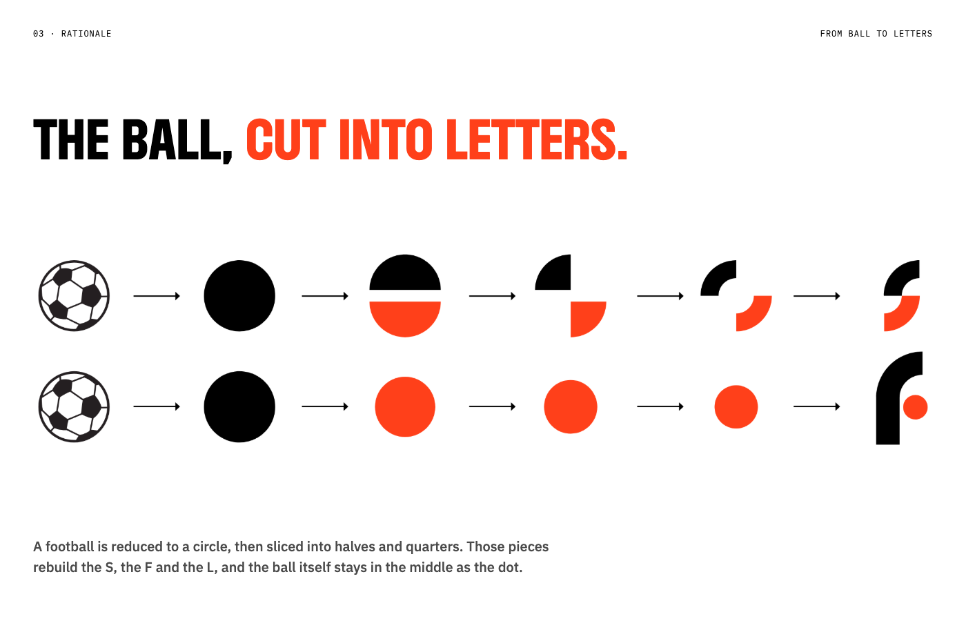
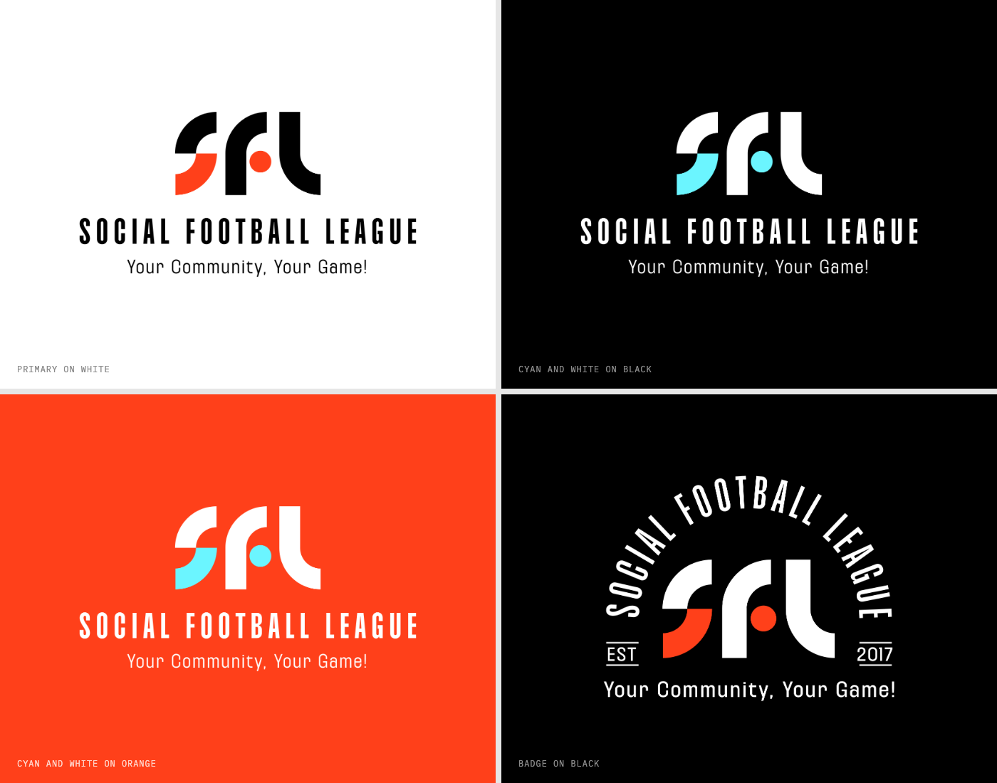
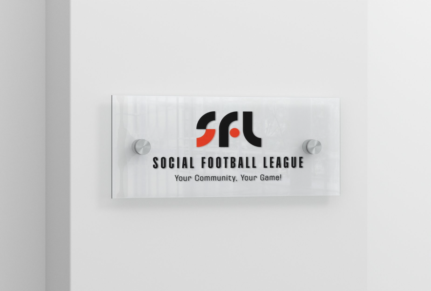
The ball, cut into letters. A football is reduced to a circle, then sliced into halves and quarters. Those pieces rebuild the S, the F and the L, and the ball itself stays in the middle as the dot.
The result.
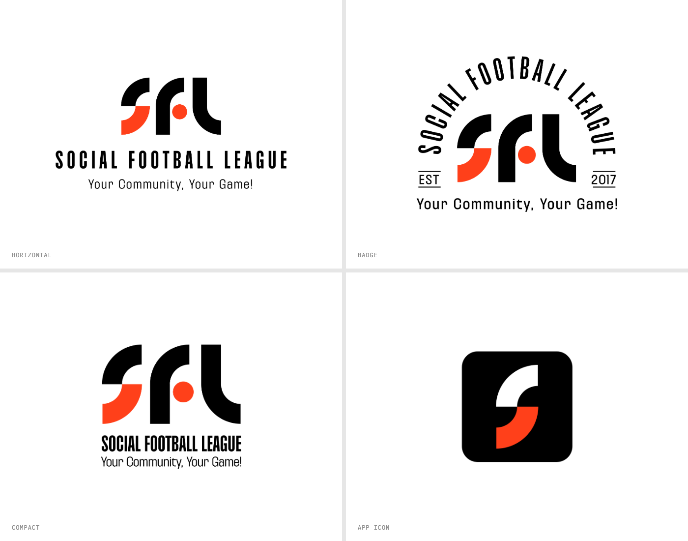
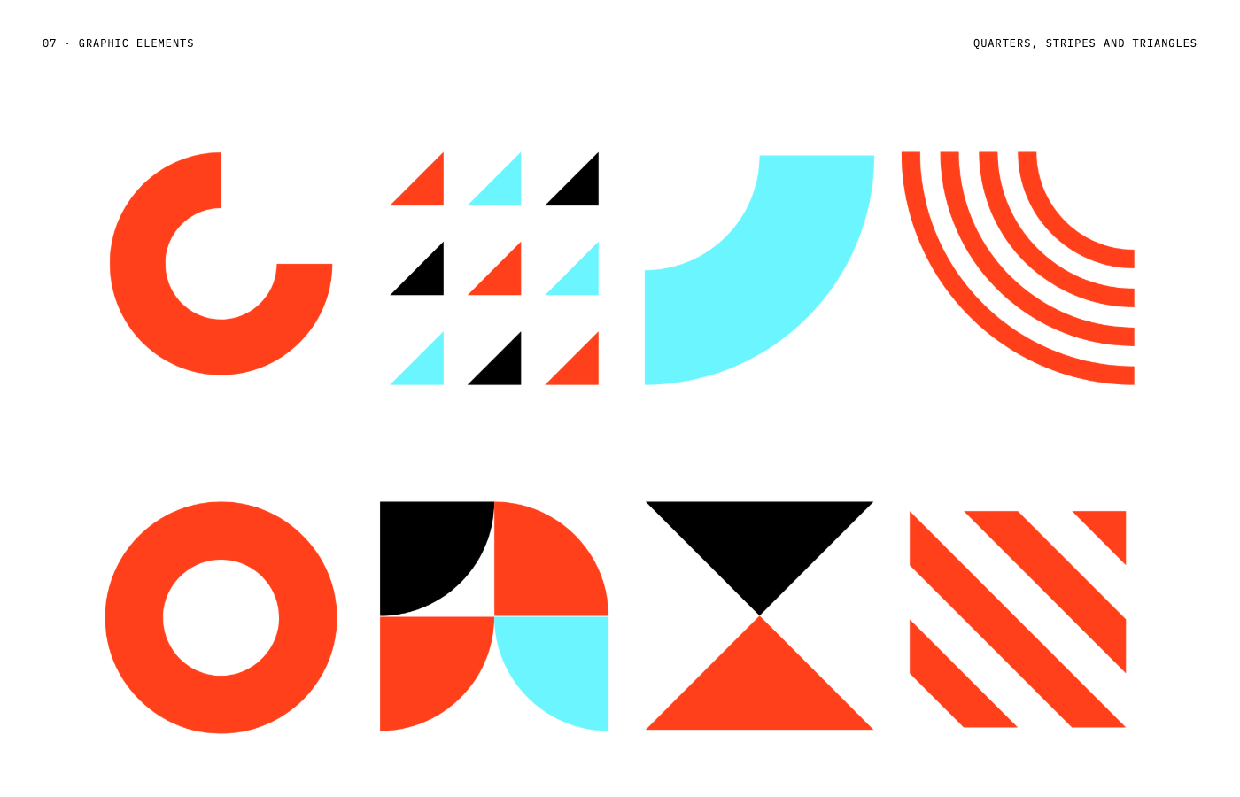
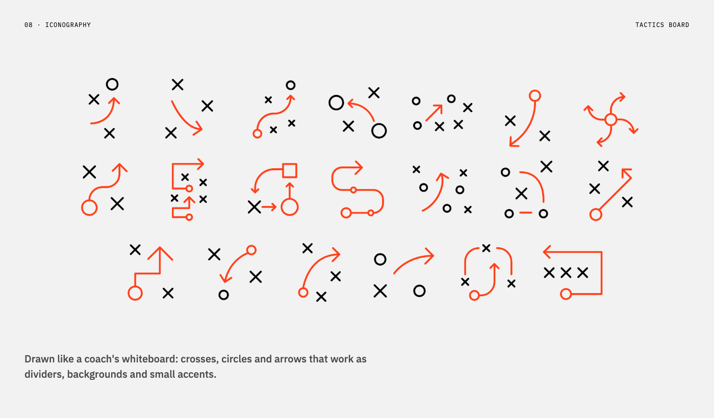
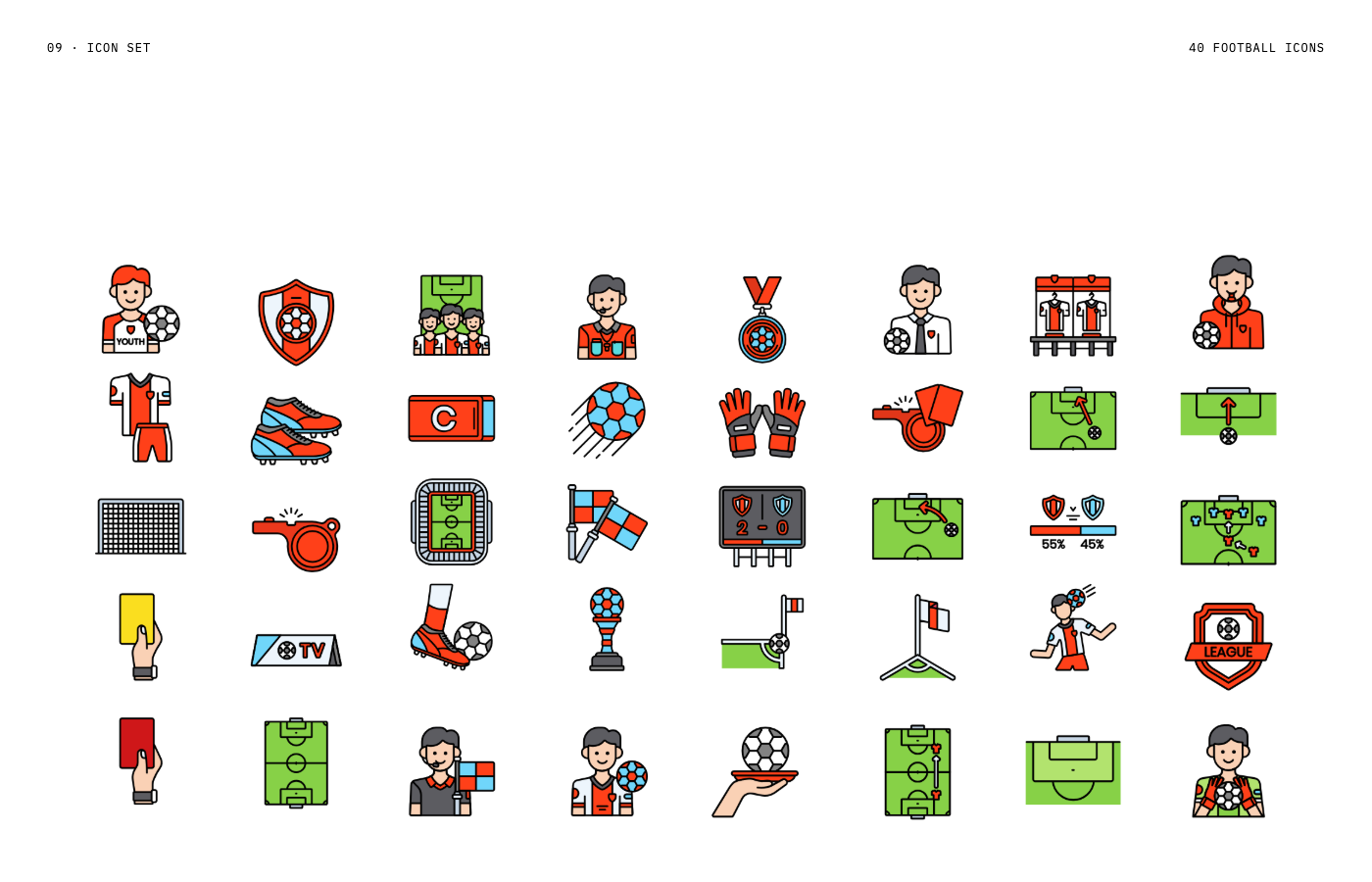
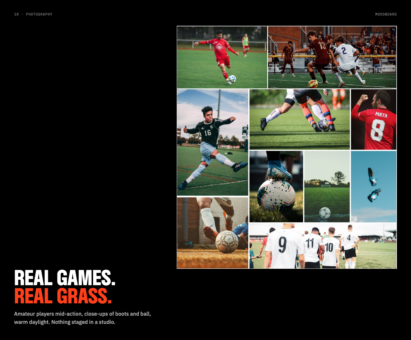
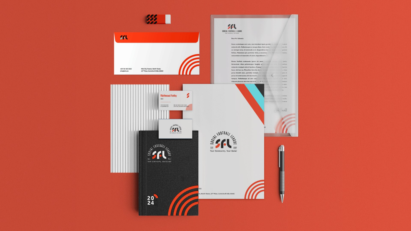
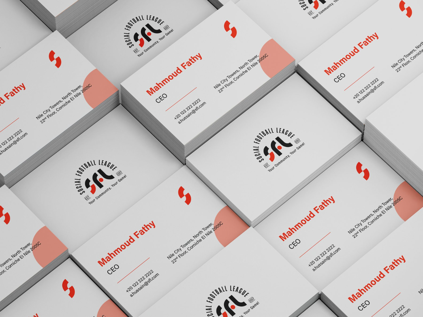
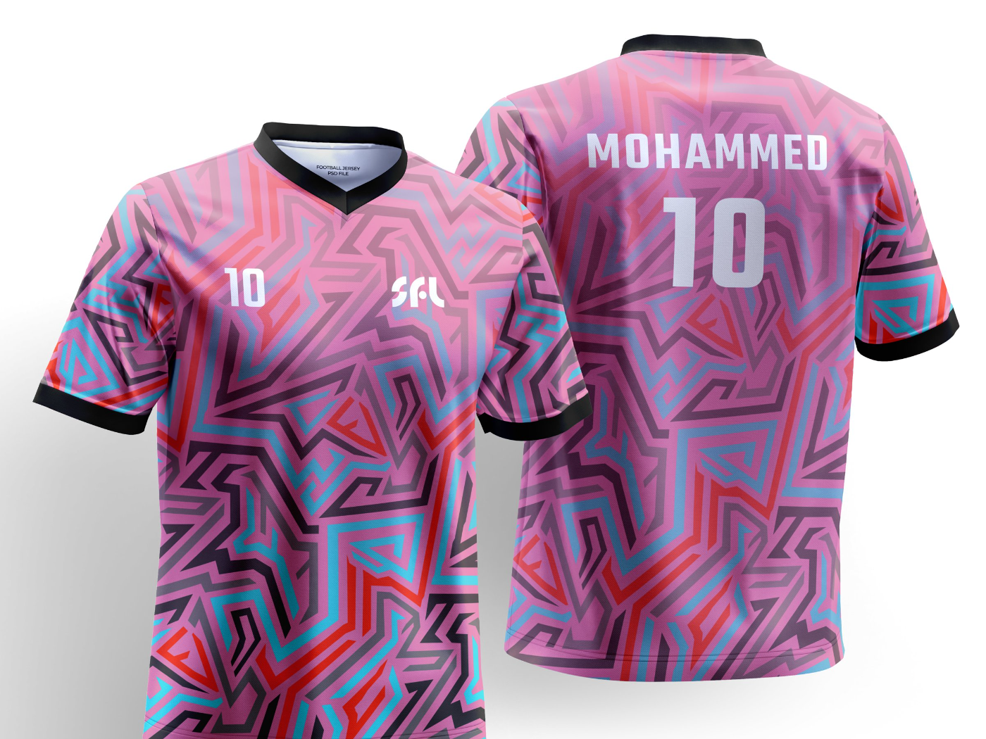
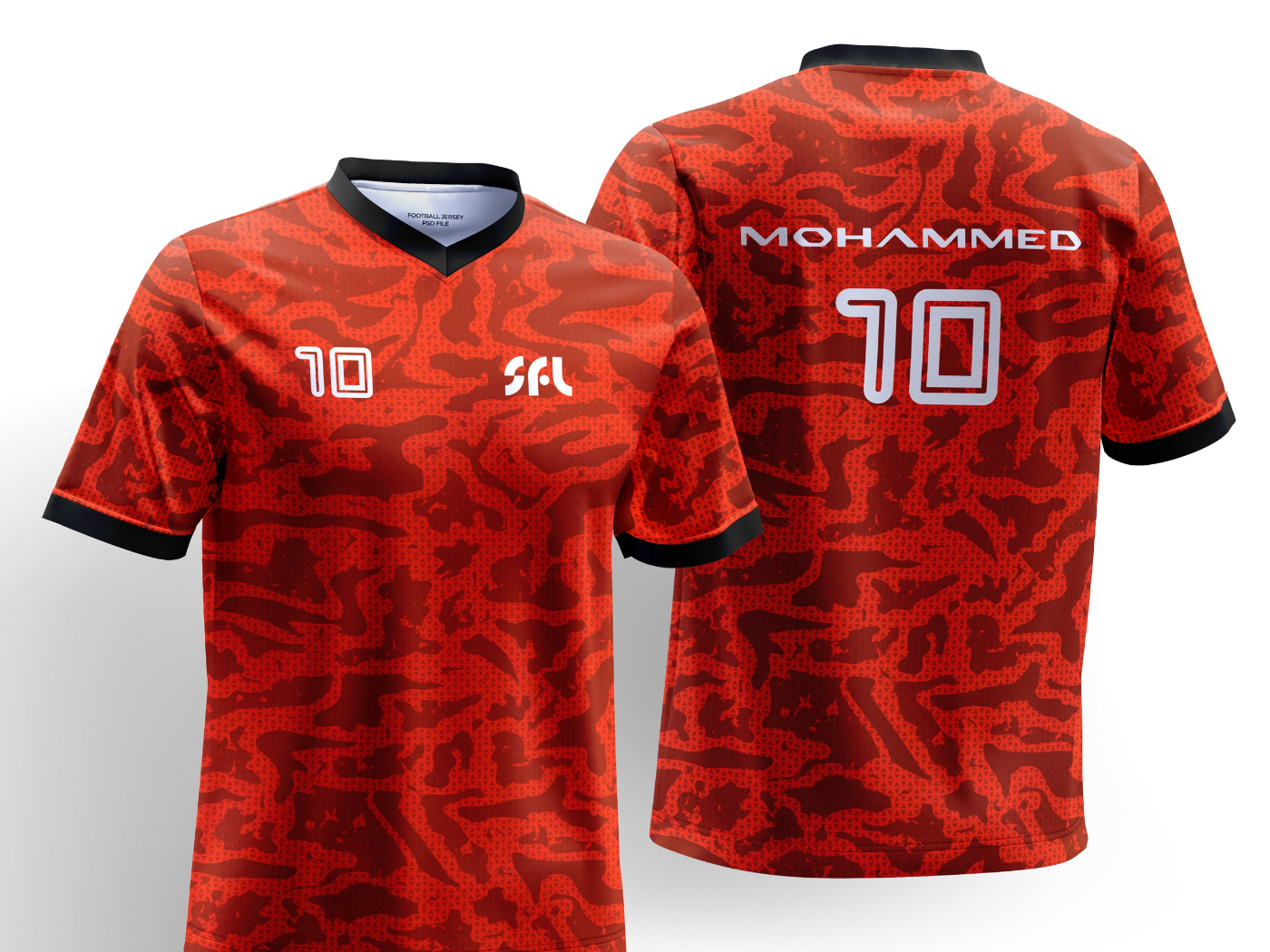
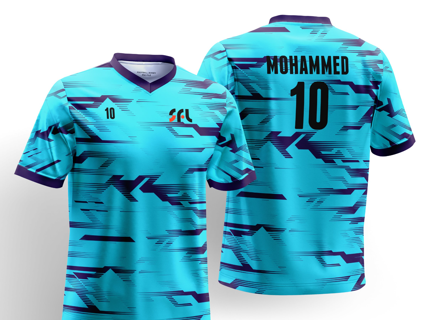
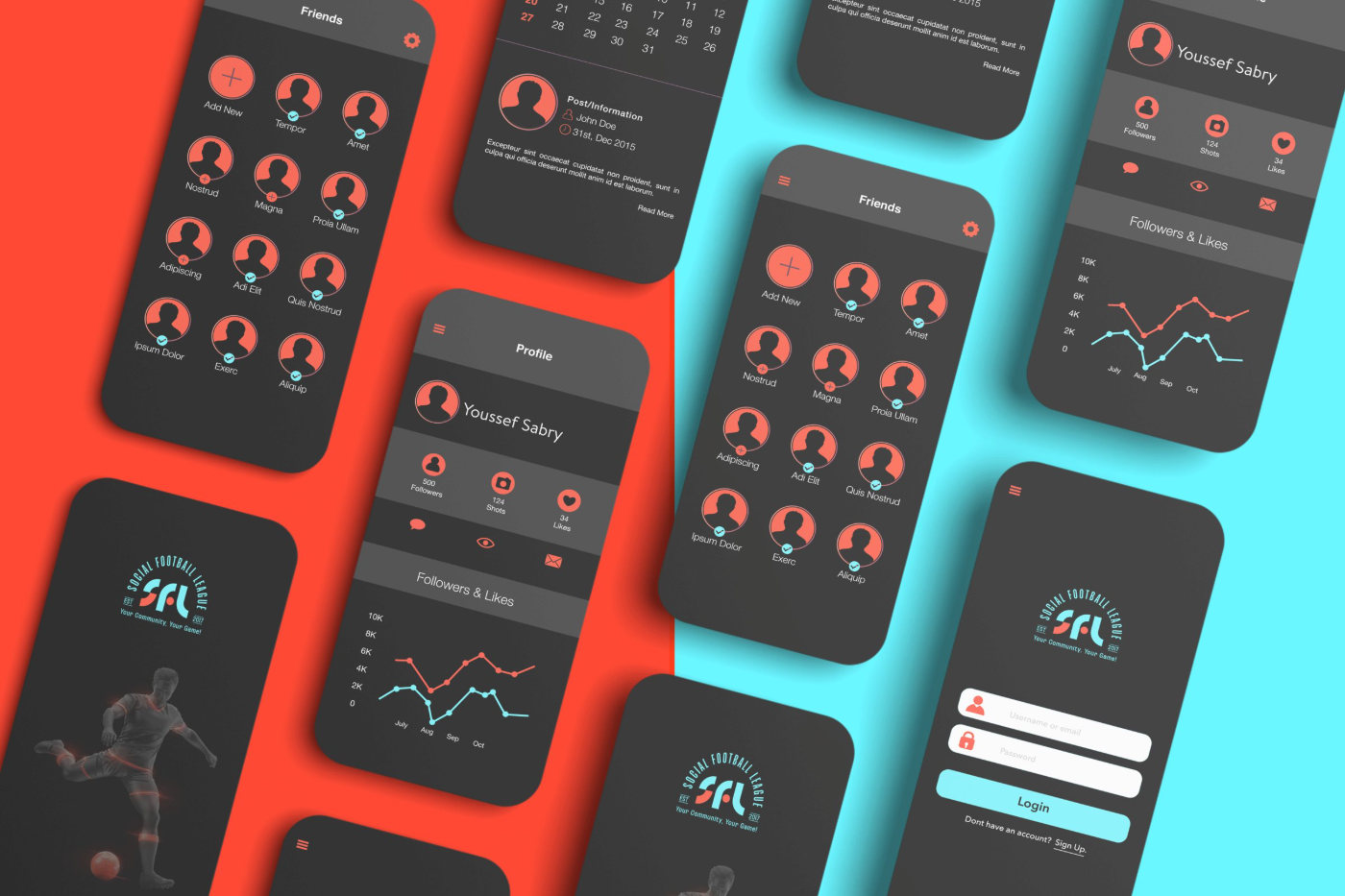
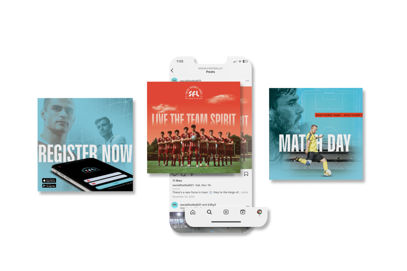
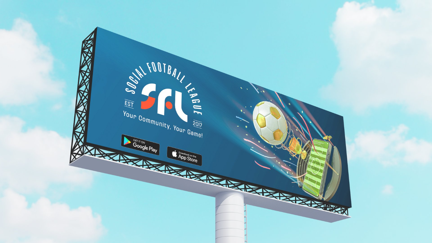
An identity manual and a loud, flexible system: pattern, play diagrams and icons, three kit colourways, an app and social media, signage, billboards, flags and merchandise.